
Sambazon Rebrand: Animation Direction + Logo Design
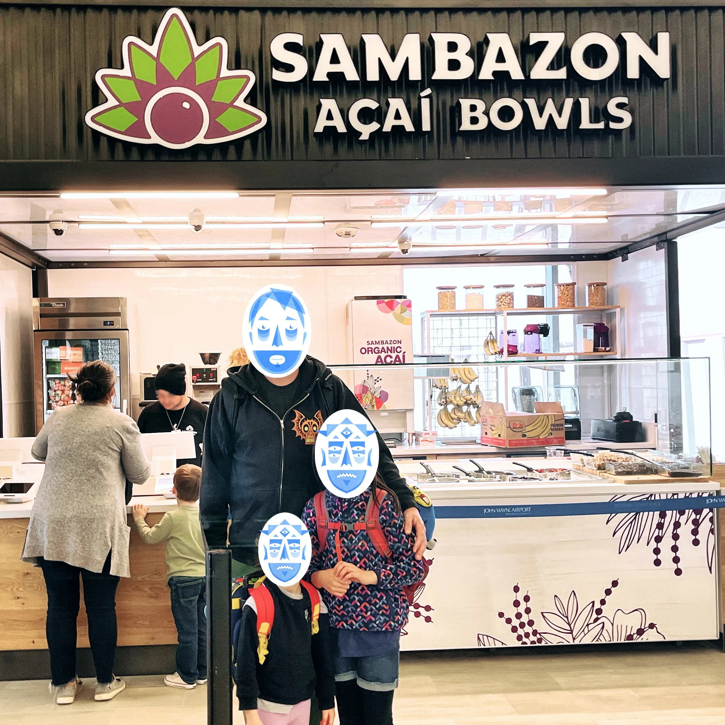
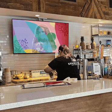
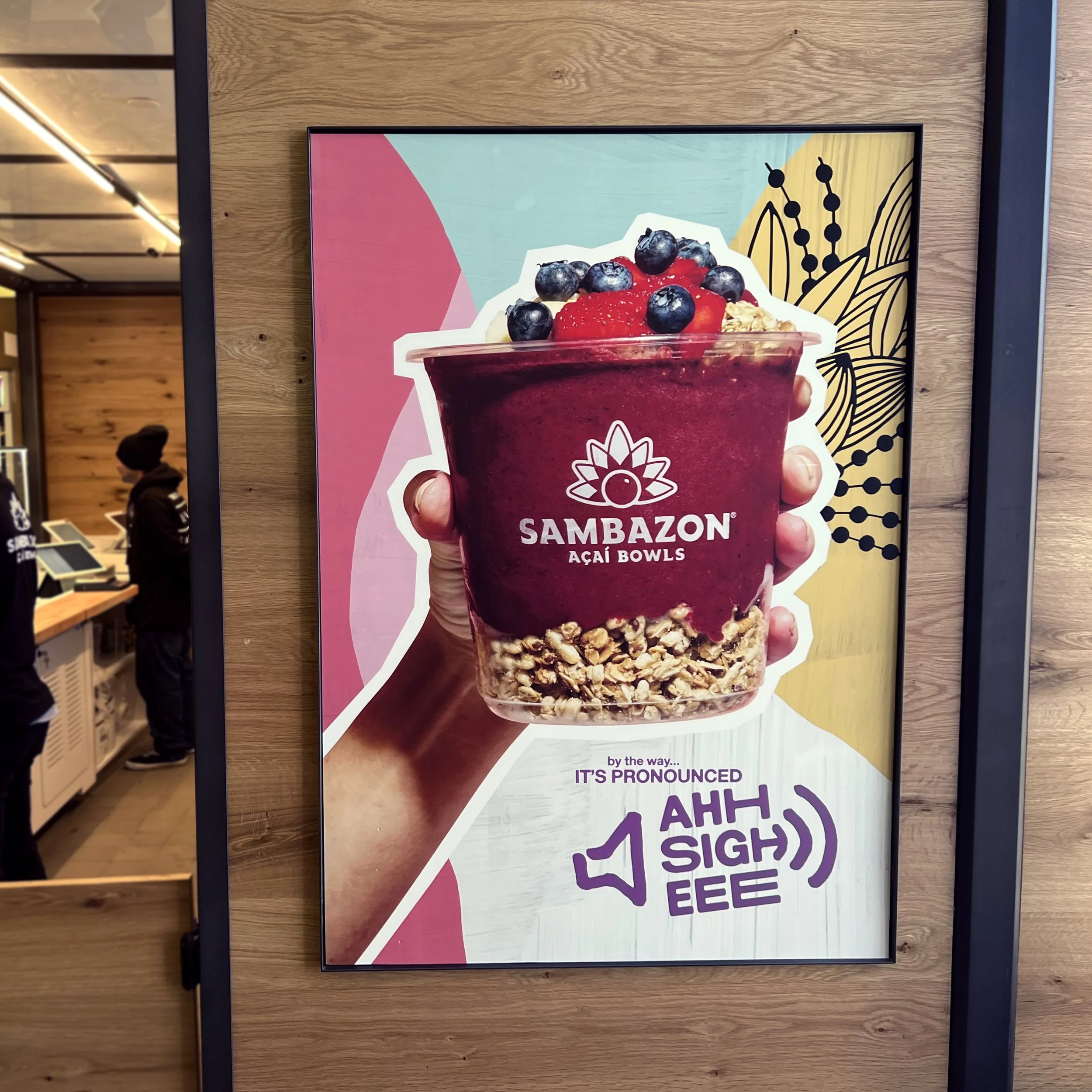
For their most recent rebrand, Sambazon brought me in to help define the look and feel of the animation for their media campaigns. Working with a small team, I created videos for both broadcast and social along with a brand manifesto that is featured inside of their Açaí cafes. These Bowl Shops are located throughout southern California as well as in a growing number of airports around the country. While working on the animation, I also ended up designing their new logo.


During the course of the rebrand, I was asked to help update the Sambazon logo. They were looking to simplify, while still retaining the basic spirit of the original Amazon Warrior. Our first approach focused on the headress and feathers. But after working through an exhaustive array of variations, we decided to change course. The sacred geometry had always been an integral brand, so I decided to return to that simple design element. Radiating from the Açai berry, this symbol illustrates the powerful transformational energy that Açaí can bring to your body, spirit and the Amazon Rainforest.


Client: Sambazon
Client Art Direction: Sebastien Marcq
Creative Direction: Scott Cromer
Art Direction: Clint Beastwood, Mishy Cass
Animation: Clint Beastwood
Floral Paintings: Julia Fontes